Important Update - Brief Change


I'm posting this as an update of sorts to those of you who've been viewing this blog. Up until now the focus of this blog, the brief I assigned myself to complete, was to create the first level to an upcoming game, as well as two or three ancillary products.

Well that is changing.

Due to certain circumstances I no longer have the time I'll need to complete this task. As such I'm changing briefs and am now doing a new brief:

Creating a promotion package for an upcoming game -

This includes two TV advertisements as my main task, as well as at least two of either:

- The cover of the game's package
- A magazine advertisement for the game
- Two  hyperlinked webpages from the game's website

Now I just want to clarify something. As of currently I have no intention of taking down any work I've previously done. That will all be staying up for now. Also the concept for the game I've come up with is not changing in any way. Everything is remaining the same. I'm just doing a different piece of work for it.

Alright. I hope that this isn't too bothersome and I'll continue to update this blog with new posts.

The link down below will take you to the home page, or you can use the navigation bar above.

Thanks for your views.


Practical Work - Evaluation Questions

Final step. The evaluation of this project.

To end to this project off I'm going to do something a little different. There are four questions in this evaluation that I have to complete, in as strong a detail as I can. If I can't answer these questions, there is something that I've done wrong, or missed out on during my time doing this project.

What I'm going to do is, instead of doing long written answers in my traditional blog posting style, I'm going to do a voice recording of me answering each one, and provide a video alongside it. It's much better than reading through an otherwise boring evaluation, and I have more freedom to express the answers in my own words.

Now let's see then if I've done enough to answer each of these properly, without having to lie, waffle, or drag out any of my points. Here we go.

Also here is the link to the written notes I used to make these videos.


1. In what ways does your media product use, develop or challenge forms and conventions of real media products?


2. How effective is the combination of your main product and ancillary tasks?


3. What have you learned from your audience feedback?


4. How did you use media technologies in the construction and research, planning and evaluation stages?


And wow! That is it! We're done, finally! I cannot say how pleased I am to finally get this last post put up and can finally put the lid on this coursework once and for all. It's unlikely I'll be coming back to this blog anymore. MOBO is however very promising as a game, so I might be tempted, if I have the time and money and skills, to make it into something more. 

As it is, its only purpose now is to get me a grade for my Media Studies A level, and damn I hope it's a good one. i've put hours and hours of work into this blog. from seven posts on my previous blog, this final post marks the 40th on this one! That's how much more work I put in from last year. Now I'm off to catch up on all of the hours of sleep that I lost while doing all of this.

So anyway, I really hope you've enjoyed following along with this work, the view count is greatly appreciated. More than 2000 views is a very satisfying amount of views to have for this.
Thank you so much for taking the time to read, and if you find something else in the future that you decide to follow, make sure to stay updated! 

This is the blog of Sam Thompson and I can officially say, this coursework is at long last finished!!!

Evaluation Written Notes

Just for referential sake, these are my written notes that I used to do the full evaluation. These are here just so you can see my where the spoken stuff came from. I've just done them as conventional and simple bullet points, my ideal style of planning. Its not too hard on the eyes at least, and hopefully you can see where all of what I talked about came from.

1. In what ways does your media product use, develop or challenge forms and conventions of real media products?

Sticking to convention, the game concept -

- Designed with smartphone platforms and touchscreen technology in mind

- Heavily influenced by other mainstream app games such as Candy Crush and Angry Birds

- My intention with the product was to implement the addictive quality of app games into my game. I believe that's key in making the game successful commercially.

- It doesn't challenge the forms and conventions of real media products. It's not really designed to. It fits rather snugly into the puzzle/platformer genre of app games. With such a tremendous variety of different app games out there, it's rather difficult to make something that stands out.

The convention challengers - 

- The style of advertising. Inspiration is taken more from adverts for console games and animated films in its concept. 

- Most real app developers haven't the money to spend on making pricey TV adverts, so have to make do with web advertising, and popularity gain on the app store. 

- Those that do create TV adverts for their ads are often well established companies that gain income from various sources, not just the game. 

- Most TV adverts of this type also include some footage of the app itself being used. Given the nature of my brief that wasn't possible to do in the time frame I had, although, If I'd waited longer to change briefs, I could've possibly made some footage of the game itself. As it was I instead used the trailer to portray the key concepts of the game, introduce the environment and the character, so I could expand on it later.

2. How effective is the combination of your main product and ancillary tasks?

Consistency -

1. Colours. They all use the same colours schemes, swatches on illustrator.

2. Objects. In each one I incorporated the same objects, Mobo the character, the hexes

3. Art Style. It was seen throughout my creation and development process that my art style changed and evolved. Mobo initially had a different colour scheme and the title had detailed shading. By the end of the project though both of the ancillaries and the ending slate for the trailers all used the same colours, the same types of images, and know had a consistent and identifiable art art style - simplistic gradient shading mixed with solid colour, and solid black outlines on the edges of the objects.

Complimentary -

1. Main image on the magazine advert is of a scene in the trailer, showing Mobo before he starts the level. It's actually directly redrawn as an image from one of the screenshots of the trailer animation inside blender.

2. Game icon emphasises Mobo clearly, with the framing of the hexes around him, and his face shown clearly.

3. The style isn't lazy. The ancillaries don't reuse the artwork or imagery from each other. They're all different and original. Only exception is using the screenshots as game footage for the magazine ad.

4. They each provide something different to the whole picture of the game. The trailer looks into the gameplay and character. The magazine ad backs it up with worded information on the captions and a different viewpoint of the scene. It also has more details about the game than the trailer does. The icon shows Mobo in a different light. He's inviting you into the world in the trailer, through the gap in the hexes.

3. What have you learned from your audience feedback?

Questionnaire -

- By far and away my biggest contributor to deciding on how the game would be designed.

- My target demographic was teenagers, and it was teenagers that I got feedback from.

- Developed an idea of the particular elements of an app game that draws people to play them, then come back and play them again.

- Figured out the sort of price people are willing to pay for downloading games.

- Learned the different opinions that people had on the impact that app games are having on society.

- Discovered which particular genres of app games are the most popular, and which games people can easily identify, to indicate which games are commercially successful.

Trailers -

- I shared the completed trailers around with family and friends. Nothing but positive feedback. 

- Refer to my written notes, and the images, showing the feedback messages sent.

- That this blog seems to be worth reading, if the view count is anything to go by.

4. How did you use media technologies in the construction and research, planning and evaluation stages?

General -

- The world wide web proved indispensable for conducting research into the industry of gaming. Also without it this blog wouldn't have been made.

- I made use of my family's various smartphones to play and analyse the different app games that I reviewed.

- I made a point of formatting this blog in preparation for this project, looking into things to spruce it up and improve it, to give it a more professional feel. The blog itself is the platform that I'm using to detail this coursework. I could very easily have just made written notes and kept it in a folder, but this itself is making use of technology

Social -

- When I was doing the questionnaire, I encouraged people viewing the blog to put in their own answers to the questionnaire, either by emailing or by posting a comment on the questionnaire blog post.

- Through email I was able to keep in touch with my teachers to get instructions and feedback on my work. I also used it to obtain questionnaire results and other feedback for my research into audiences.

- When I was looking for feedback on my two trailers, I posted them up in three different places: the blog itself, my youtube channel, and my facebook page, and encouraged feedback on each one. I also shared the trailer around among my family and friends, who in turn linked the videos to their own associates, who then emailed me their own feedback.

Practice -

- I also put thought into setting up an online survey for my questionnaire, using a tool called SurveyMonkey, but decided against it due to the cost of doing so.

- As I detailed in a different post, I had a go at using Unity, following a tutorial to make a simplistic game, in preparation for making the actual game, before changing the brief and having no need for the software.

- Screen capture software known as jing, when I was looking for a way to record my animation. before I realised I could output the animation as a quicktime film and import it straight to iMovie.

Key Technologies -

- There are also of course the two pieces of software for making my game: Blender, the modelling software, and iMovie, the movie creator, both of which were key for my work being completed.

- The images I used for my post on the concepts for my game were drawn and coloured in Adobe Illustrator and Adobe Photoshop respectively.


Research - App Game Advertising

As I've seen in my textual analysis, there are indeed cases of TV/ youtube ads used to advertise smartphone apps. What I realise though is that the number of promotional adverts for adverts does not add up to anywhere near the total number of apps out there.

What that stands to reason is that there are more ways to advertise an app than just advertising; cheaper, easier, more viable ways. What also needs considering is that many apps are free to download, but in business terms that means no profit. That means there also must be a way to generate revenue off of app games.

These two points are what this research post is about. I'm going to look into some of the few relevant sources out there I could get my hands on, and work out the answers for these points. Since I'm not just doing a TV advert but a whole promotional package I need to look at other advertising formats. Now I already covered the various varieties of advertising, both new and traditional, in a previous research post. This time I'm looking at specifics, which of those varieties, if any, are used in app game promotion.

As usual I'll include my sources as links, so you can see where the information came from

The App Stores:

Apple's App Store
Windows App Store
Google Play Android App Store
Blackberry App Store

Let's start off with the one that's most obvious. You'd expect app games to be showcased effectively where they'd be bought from. There's an app store for each of the key platforms, they being iOS, Android, Windows, and Blackberry.

The store's main way of promoting ads comes in the form of charts for top 10s or top 25s or something of a similar nature. Through looking at each one they all showcase new apps, with a chart for the newest releases. They also highlight which games are the most frequently bought, and also differentiate between the free apps and the apps that cost money by having two popularity lists, one for each of them. Each app also has its ow page where all of its product description and overview can be found.

There's also the rate and review option for the apps. Anyone with an account can create a rating for the game, and also provide feedback on the game, be it praise, analysis or critique. There are also apps recommended by the store's editors, which can be seen on their own page

Each store also identifies that games are one of the most popular genres by signifying the game genre of apps in some way, shape or form.

Just going to look at the App store via google brings up a list of different app genres, and games alone has an entire list of sub-genres underneath it, something that none of the other genres have with the exception of the Newsstand genre. Clicking on the genre itself, or any of the sub-genres, brings up a list  of apps in order of their popularity.

When viewed from the Android site, the categories drop down list has games and all of its sub-genres taking up an entire side, whilst every other genre occupies the other. There's also a independent button for the genre that takes you directly to the game list, something none of the other categories have on the website.

The Blackberry site has a bar of main categories across its top, with games being the second option behind Apps in general, and also contains the charts for popular and new games. The Windows Store has a list of popular genres, with Games sitting at the top of the list and some of the popular games shown alongside it.

Web Advertising -

Facebook - Create your own Facebook Ads
Appnext, promoting apps through advertisements

When I was finding the sources, and was coming up rather short, I became thankful for the advertising section of google results. Normally I ignore it but through looking at the links I came across some actual sites that allowed you to create web adverts for apps, the sort of ads that you find as pop-ups along the sides of webpages.

Facebook Ads -

I remember back when I watched The Social Network, how Zuckerberg was completely against adverts being incorporated onto Facebook. The first link I looked at contradicted that entirely.

Because I have a Facebook account I was able to actually take a look at the ad creator and see what I myself could do with the function, what different types of things I could potentially promote.

They included adverts to websites and also encouraging what to do on the site, meaning I could potentially create an ad to promote this very blog, or possibly encourage comments that the blog is lacking in considerably. I could also try and increase the popularity of my posts on Facebook itself, or use it to get more likes. You can also use it to promote events that you know of.

If you own or are employed in a shopping company or store cha

in you can even use the ads to promote offers and deals on your products.

Most key to this topic however you can create promotional ads to let people know of your apps, and also encourage them to install it or boost activity on the app by showing off new features or challenges. I was tempted to promote MOBO through this method, just to add a bit more to the blog, but you actually need the app itself or its URL to exist, so I was cut off at that hurdle.

appnext -

This was the other link that I looked at. From news buzz, and its position on the Google search list, it seems to be a prominent source for advertising apps, be they games or not. Appnext is a technology platform that can be used to promote ads for apps, or so it says on its front page. I tried signing up myself to get a closer look but apparently both of my email addresses are already in use on the sight, so I couldn't get any further in.

What I could tell about the site was that it's primarily designed for people who have businesses in advertising. The software can be used to manage and promote apps efficiently. It portrays itself as a safe, trustworthy and self-controllable way to monetize any adverts you create.

The site is shown to be compatible with Facebook, Apple, Android and also Unity which, if you may remember, was the software I potentially would be using to make the game. iOS was the platform I hand in mind for the game as well, and I'd already looked at the Facebook advertising, so for me at least this may be an interesting site to keep tabs on.

Facebook Logo
appnext Logo

Main Piece - The Completed Trailers

So finally we emerge at the other end of this topic. Finally I have what you've been waiting for. From Summer 2013 through till Spring 2014, this project has been in development, and technically it still is, and will remain so unless I decide to expand on it in the future. What I can show you however is the final part of the promotional package for MOBO, developed and designed almost entirely by yours truly, with some support from other people.

Here it is. The promotional trailer for the game. Enjoy!


And also the short trailer. Enjoy!


There was only one thing about the adverts that I changed during the editing process. I opted out of providing a voice for Mobo. I was going to voice him myself, and the message at the start is actually me  talking in his voice, but when I played the audio back where it would normally be in the clip it just didn't fit with the other sounds I put in.

I'm extremely pleased with the rest of the sound though. I made a point not to rush the sound. I added sounds in bit by bit, then looked at what I'd got and decided on what the next sound should be. It allowed me to keep the sound consistent, and I'm also extremely thankful for the vast quantity of Sound Files that iMovie has. Overall I'm very pleased with the outcome, and I hope these trailers are of a good standard for you guys too.

Now I think is a good time to state something. I've actually had to do this animation twice, starting almost from base line the second time. I created this animation quite a while ago, but in the run up to this final stretch I restarted my computer and upon searching for the file again, found that almost all of it had gone. Wiped, not binned, wiped, erased, like deleting save data on a game. I'd lost almost all of my animation, so to create it all over again and get the rest of my work in on time is something I myself am very proud of.

So now that's pretty much everything done. I'll be taking a break from blog work for a while, and then I'll be back to wind up this coursework with the evaluation. And also you can expect it to be in a different format to what you've seen so far on this blog.

In the mean time I would also really appreciate some feedback on the videos. Say what you will about it. Any and all feedback would help me immensely. Just leave a youtube comment, or you can put a comment about it in the comment box. It's also up on my Facebook profile if you want to view it from there. As I said any and all feedback is greatly appreciated.

Thank you all so much for taking the time to view this blog, and until I round things of with the evaluation, stay updated!

Main Piece - Step. 3 - The Creation Stage

As I've talked about in the past, Blender was now in my arsenal of tools, and I was going to use it as my key software in my previous brief. Through blender at this point I can create meshes, I can add base materials to them, and most importantly I can animate.

So I started up this task. I had my concepts, my character, my setting, my key mechanics, and my objects, and I was going to use them to create the trailer. In short the main work for this task was going to be done in Blender.

Creating the Meshes (Objects) -

So to start off with you may remember the objects that I showed you the artwork of. As far as the storyboards are concerned, I'll only be using three of the objects in the trailer; the standard platforms, the solid platforms, and the end platform. Here are their images once again to remind you:


As I mentioned previously I'd taken tutorials on how to use blender, in preparation for this project, and I'd also got some practice at modelling when I designed the jewelled medal.

Thanks to the pictures I knew exactly how they'd be modelled, and thanks to the practice I was able to create the meshes relatively quickly.

On the right are the screenshots I took whilst inside blender, showing the rendered meshes for each one of these three objects.

There are obviously some aesthetic changes. The end platform has bigger, thicker pillars, and the standard platform now has a streak of blue going round its edges, along with a blue outline around its top. I also shortened the pillars for the end platform after I created the whole scene for the trailer, which is what's coming up next.


Creating the Level -

The setting that I had in mind was the starting level for the game, and as per my game's style I also needed to create the level's puzzle.

As you might remember from my concepts page, the aim of the game is to repair broken circuit boards inside the game platform's operating system, be that a smart phone, ipad, or computer. These circuit boards a made of hexes, which require stepping on. 

In order to finish a level you have to step on every hex and also reach the end. This means each level has to meet two criteria in its style, firstly it needs to be possible to step on every hex, and secondly the exit has to be reachable after the first criteria has been fulfilled.
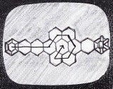
Because it was the first level it didn't need to be complex, it just had to fit the criteria. From that I created a basic level, the layout of which I showed in the storyboard, but I will show you again to remind you.

The only change I made to the level was that I made it symmetrical by adding another hex to the right hand side leading up to the end platform. Other than that it's exactly the same.

The diagram, as you may remember, shows the route that Mobo takes to complete the level which, as you can see, is incorrect.

Just by looking at the design, how many different routes can you see that cover every hex and reach the end?

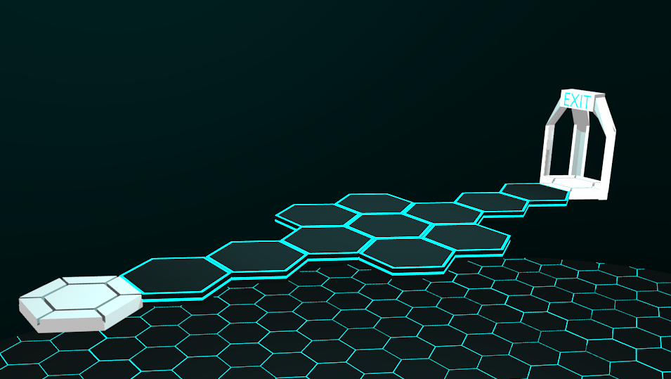
The image below shows the level as it appears fully rendered in Blender:


As you can see I put the meshes I'd made to use when making this level. These platforms are 50m above the the circuit board they're broken off from, and there's a gap in the board where they fit in place, although its not shown in the picture.

The reason the board cuts off so suddenly is because there's an opaque dome surrounding the level. The dome is there due to limitation I found. The camera's used in Blender have a finite range of view after which they don't register any meshes in their view, with the clipped space appearing as plain grey. The range can be adjusted but it can slow down rendering, hence the dome, as it serves as a boundary and makes it seem more like a room as a result.

I originally wanted to resolve the problem by creating a box, made on all sides with the hexagons I used for the floor, but when I played the animation with it in place, the frame rate had had dropped to below half of what it was meant to be playing at. Instead I just kept the flooring and replaced the walls with the dome, which also meant I could play with perspective and make the space seem infinite, or at least hard to discern the edge of the level.


Creating Mobo -

Here we finally have another of the main reasons why I designed Mobo the way I did. If you took a look at my creation process for Mobo you may remember that I was looking for a character that was simplistic but effective. My answer to that was to create him out hexagons, that could flatten out and become a flat grid, or articulate into a humanoid figure.

What that meant was that his mesh would be incredibly simplistic to design. Articulation would come later but thanks to his design, this part of the project was made much simpler.

Down below you've got a screenshot straight from blender, showing Mobo when I first made him, without any animation:


For you animators out there who have done animation of humans, with full-body realistic rigging, you'll know how complex it is to construct and animate it. As I mentioned in my blender practice post I was coming into the project a complete novice, and there's no way I could've learned complex animation and rigging in the time I had. Again Mobo's design was my saving grace. Because all of his joints, with the exception of his shoulders and upper legs, were hinge joints, with a good rigging in place his animation could become incredibly easy.

For those who don't know what a rigging is in modelling terms it's a framework or skeleton that you can attach to an object (mesh) that you've made, which you can then use to animate more easily. Even so I still had to animate his transformation sequence, as well as his landing, and his running movements, all with no past experience of animating.

Below is another screenshot showing Mobo in his activated mode, with his rigging visible highlighted in yellow:


The final step to complete Mobo's creation was the addition of his facial features. I wanted his character to be shown through his expressions, and that meant animating them as well.

You may remember, if you looked on the concept page for Mobo himself, I also included several examples of his different facial expressions:


The challenge with the rigging I made was how I'd make the facial features appear as, before Mobo activates, neither the facial features or the fingers are visible. It was impossible to make them appear out of thin air, due to the nature of the animation, so I had to conceal them to begin with and then come up with a rigging that made them appear from inside the head piece, or hand pieces.

Also, due to having limitations on how I could edit the objects, I instead had to create four different mouthes, each of which had their own rigging, and each appeared at various times, replacing the previous expression.

Below are sample screenshots showing each of the expressions rendered in the animation:


Creating the Trailer -

This is where the storyboard came in. It's worth noting that I already had part of an animation to work with, thanks to my work for the previous brief. I'd created Mobo's mesh and done an animation of him transforming and landing on the platforms. I designed my initial story board around that animation, so as not to put the work to waste.

From the animation I already had and the storyboards that I put together, I got started. As I went through I also evaluated what it looked like through the camera and made adjustments to the shots and animation, so as to make it look better.

This of course meant shying away from the storyboard, but that was my plan to begin with. There's only so much the imagination can create. The rest comes from observation and filling in the imagination's gaps, so as to perfect and create the image in your mind.

As such we have here a new screenplay for the trailer, detailing the changes made since the original in the completed animation, and with actual Blender screenshots rather than drawn pictures:


Screenplay 1 - Main Trailer

1. Opening shot of the level's exit, which then tracks backwards, showing the rest of the level, before stopping at the starting platform.

- Now there are three different shots used to establish the environment - the first tilting downwards, and gradually bring the level into view from a side angle. 
- The next shot is a high-angled shot looking down at the level, panning and tracking in conjunction to show the stage from another angle. 

- The third is a shot that views the stage from directly behind the exit, before tracking forwards through the pillars of the end platform and over the rest of the level, before coming to a stop at the starting platform.
2.  Camera then tilts upward to show Mobo, in his inactive state, descending down towards the starting platform. The shot then cuts to just beside him, and then keeps following him as he transforms, letting gravity take hold to drop him down to the starting platform.
- The first shot is largely unchanged, except the camera now views Mobo from the front. 
- The second shot is slightly different. It's taken from just above Mobo, giving a high-angle shot, and starts off on his left hand side, before slowly tracking around his back. As it does so the level can be seen below as the camera shifts to the right hand side of Mobo.
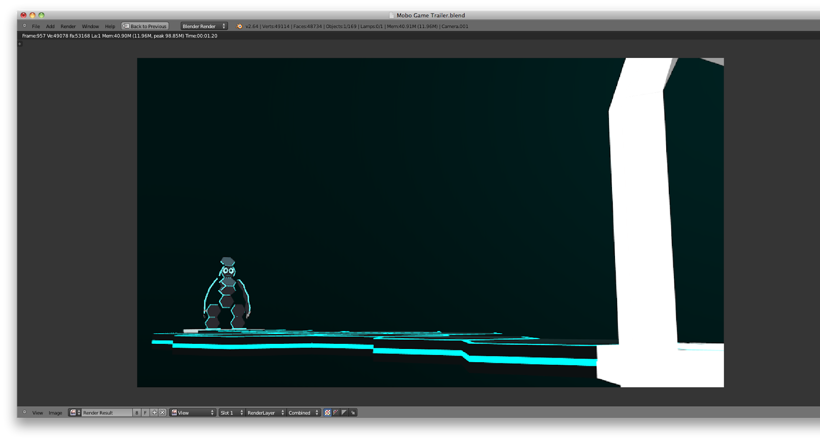
- The next shot cuts to viewing Mobo from the front and the side, and follows him as he descends, before showing his transformation and then his fall down to the level beneath. 


3. Upon Mobo's full transformation the camera cuts to a side shot of him landing in a crouching position. As he recovers from the fall his fingers and facial features emerge. There's a pause, and then the camera cuts to a close-up shot of Mobo's face from the front, as he lifts his head up and his eyes open.

- Unchanged, with the exception that there's no prominent pause. The shot changes a soon as his features emerge and he recovers from landing.


4. Shot cuts to a higher shot, with Mobo standing up, his face filling the frame, and looking around. Camera cuts to show Mobo's line of sight, and what's in front of him before focusing and zooming in on the exit.
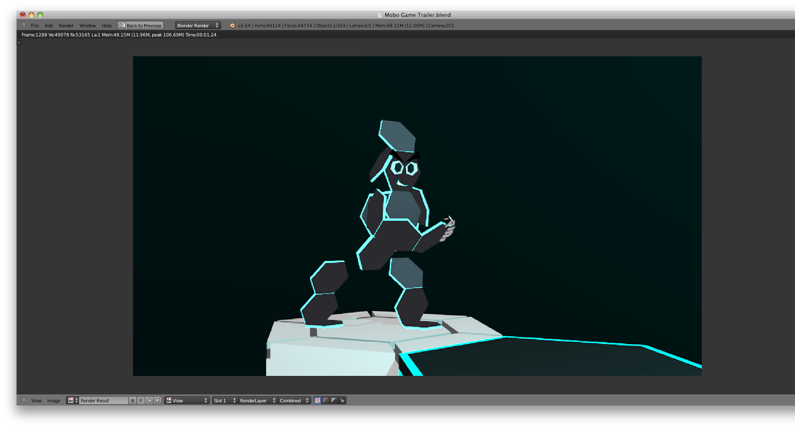
- The first part was overhauled. Now, instead of the camera cutting to a high shot, it instead continues on from the previous shot, zooming out from Mobo's face and tracking backwards, slightly downward and slightly left, bringing the rest of the level into view as he stands up and takes a breath. The camera stops at the end platform, with it's left most pillar just visible at the edge of the frame as Mobo seemingly breathes out.
- The next shot cuts back to Mobo from his diagonal right, with his whole body within the frame, narrowing his eyes and looking down at the platform in front of him. He then starts to plan his route, bobbing his head in confirmation as his view goes to each one.

- After a couple of nods the shot changes to a point-of-view shot showing Mobo's view of the level, with the camera following his eye and head movements as he plans his path before stopping and pausing at the end platform.


5. Camera cuts back to Mobo from the front, who grins and crouches down, readying himself to run.

- Unchanged, except that the shot of Mobo's grin is a close-up shot, before cutting back to the full-body shot of him as he crouches and readies himself to run.


6. Mobo starts off running, following the route that this storyboard frame shows. As he runs the platforms drop into place on the circuit board below, and the camera follows his progress, with various shots as he moves.

- Mobo's actions are unchanged. He still follows the path shown in the original diagram, but now there are specifics on the types of shots used as he runs.

- Carrying on from the previous shot, the camera tracks across to the opposite side of Mobo, as he clears the first two platforms. The shot continues to follow him as he moves across, now viewing his progress from the left.

- Once Mobo reaches the platform shown in the image the shot cuts to the right hand side, showing the rest of the platforms, and remains still as Mobo moves around to the final hex


7. Shot changes to a low shot of Mobo's feet stopping abruptly, followed by a close-up shot of Mobo's face, looking around puzzled. The camera cuts out to a wider view, showing that he can't reach the end. All of the platforms around him have already been dropped.

- The first shot now cuts to a low-angle shot from beneath the final platform. Mobo appears from over the platform's edge, skidding and stopping himself just in time, before stepping back with a frown on his face. 

- The shot then cuts to mid-range shot, showing Mobo looking in the camera's direction. 

- It cuts to a longer range shot, showing the immediate vicinity in the direction of Mobo's viewpoint, devoid of platforms. Mobo then looks in the direction of the camera again.

- This time the camera cuts to a high-angle shot, showing the vicinity around Mobo from above, once again showing the absence of any other platforms surrounding him.


8. Camera cuts back to a close-up shot of Mobo's face. Mobo looks back with a puzzled expression, then drop's his head and sighs.

- Largely unchanged. The first shot is the same, but the right rather than the left. Mobo's remains puzzled for a couple of seconds before his eyes widen.

-The shot then transitions to a flashback of Mobo stepping on the platforms, this time the camera makes clear the mistake he made, and also slows down the shot to add emphasis. 

- The shot then transitions back to the shot of Mobo's face, still with the same expression. There's a brief pause and then the camera quickly zooms out partly, as Mobo closes his eyes and goes to facepalm, with the camera cutting out just before it's shown.

9. Camera cuts off to a screen showing the game's title. Mobo then remarks how long he'll have to wait for help while the game's being made.

- Unchanged


Advert Ends


Storyboard 2 - Short Trailer

1. Opening shot showing Mobo from the front, sitting on the edge of the platform he's stuck on, arms folded, tapping his fingers, swinging his legs and looking grumpy. He then glances down at an imaginary watch on his arm, then looks up again, an annoyed look on his face.

- Unchanged

2. Camera cuts off to a screen showing the game's title. Mobo then quips in, stating he's still waiting.

- Unchanged


Advert Ends


As you can see from the screenshots, the animation is all done. I had my footage. Now I needed to edit it and also add audio. Thanks to my experience with iMovie in last year's blog, it was my intention to use that for the final step. I also knew it had a vast number of different sound files that I could make use of.

The total frame count for my finished animation was slightly under 2000 frames, all of which had to be rendered one by one. I was doing one of my ancillary tasks whilst waiting for the rendering process to be complete. I set the output of the animation to be a Quicktime video, then it was a matter of importing the file over to iMovie, and get started on the final stages.

I can't very well detail much of what happened in this stage, only that I was looking through different sound files and editing the footage together into what I wanted.

In next post for the main task, you'll finally get to see both completed videos. In the meantime I leave you with this screenshot of my work in iMovie. Look forward to to what's coming next, thanks for reading and stay updated.

Research - TV Advertising Regulation and a Personal Observation of Advertising in the Present Day


Regulation of TV Advertising -


If you wish to produce a TV advert and not run the risk of having it banned and therefore wasted, a lot of precious money down the drain, you need to know how adverts are regulated. As I'm doing a promotional packaging revolving around types of advertising, this is compulsory information for me to know. As such I'll be looking into regulation as part of this post, plus its going to help out in the theory side of my work, as Regulation is the topic of interest.

To start off with, all mainstream Media formats are regulated in some way, and regulators differ from country to country. In Britain the film industry has the British Board of Film Classification, with its film rating system e.g. Universal, PG, 15 and 18. The newspapers and press currently have the Press Complaints Commission, with its editors code of practice, although now the system is being revised and possibly replaced with a new regulator, due to the phone hacking incidents by the News of World.

Similarly the industry of advertising now has one main regulatory body, the Advertising Standards Authority, or ASA, which regulates almost all varieties of advertising. Naturally it will be the topic of interest.

The ASA is self-regulating, and it doesn't receive any government funding, instead getting revenue from a levy set up to provide a cut of money from all advertising space, which was initially set up to help the ASA promote itself.

All of the well known forms of advertising are regulated by the ASA. Initially it was just non-broadcast forms of advertising, whilst Ofcom handled broadcast advertising. Now however the ASA covers both broadcast and non-broadcast forms of advertising. As of more recent times this has been extended to internet advertising as well. The codes used by the ASA for internet ads don't differ at all from advertising on other media platforms. They're regulated under the same guidelines.

The ASA has four main standards that it maintains for the adverts that go through it. They are that ad's message has to be:

- Legal
- Decent
- Honest
- Truthful

At its core is a Code of Conduct - The British Code of Advertising Practice, set up initially by the Committee of Advertising Practice (CAP), and has since been updated at least 12 times to suit the changing formats of advertising, particularly the ever more prominent forms of online ads. The ASA was also made by CAP to uphold the code as its adjudicator.

The way the ASA regulates ads is based on complaints about ads that they receive. Not one complaint is ignored, and once received the ASA conducts a full investigation of the advert and refers it back to its creators to ensure the ad sticks to the regulation standards, and also its four main aims. Based on what they find the ASA choose to either uphold the complaint or withdraw it, but one comment is enough to ban an advert if it gets upheld.

Complaints generally, as in 62% of the total complaints received, are due to adverts that make misleading claims about their products. Other issues that are brought up include discrimination, sexuality, disability, sexualisation, particularly of women, being used to sell products, religious icons being used casually, and distasteful or inappropriate imagery being used, a good example being the clothing company known as Benetton, which has a history of using shocking imagery to promote their products.

As a country Britain has some of the strictest codes on advertising in the whole world, but out of the thousands of adverts that are shown in the media each year 97% of them comply with the ASA's codes. That also includes 99.7% of Alcohol ads and 99% of game ads, which is a very dependable number. It means that any inspiration I may have taken from game ads is most likely legitimate with the advertising standards.


Advertising Today -


This next part is more of a short essay based on my observation, but really that's where research sources come from; looking at someone else's observation of a particular topic and then using it to back up your own points. 

I'll still be using some outside sources to back up the work but I think that I, as an active consumer of different media types, can have a valid observation of the topic in question as well. I like to think I have learnt something about the media after growing up with it for 18 years.

The funny thing about this next part is that I initially wrote it as part of my work for my main practical piece. I realised when I read it though that it would work far far better as a piece of advertising research.


From my experience when I was younger and television channels were the main form of media, adverts were commonplace between the various kids shows I watched. As I grew older though and computer viewing started to grow stronger, I began to watch less and less television. Now I'm at the point where I barely watch it at all. What's filled the space then? Where does my media consumption come from? This blog is a clue.

Now I've seen a fair few adverts in my time, whether they be for upcoming games or not, and although the brief falls under television advertising, in this day and age new media advertising is by far and away the more popular form of advertising. 

In the past, when TV programmes were limited to a specific spot, at a specific time, on a specific day, and if you missed them you couldn't easily catch it again. Today we have IPlayer to catch shows, that have aired, any time we choose, provided it's within a certain time frame. We also have Lovefilm and Netflix as two new means to watch films anytime we wish, whereas before we had to go out and buy a DVD or go to the cinema to see a film.

Oh, and Youtube....

TV Adverts can be classed as films in their own right because, like TV programmes, their revenue comes from the number of people who watch it. The big difference however is that people are rarely looking to watch the adverts themselves. To the vast majority of people ads are an inconvenience. They're also incredibly common and competition to get an advert out to a large audience, let alone promote its production, is fiercer than a lot of other types of media. 

This puts broadcasting advertisers under a good deal more pressure to get their adverts out effectively. They know they don't have the same luxury of being actively looked for, like TV programmes and films are, so instead they play on the success of other broadcasting media. This means they have to be very precise where exactly they put their adverts to gain the greatest amount of views. Even if an advert hasn't been appreciated it's still been acknowledged, and even that can be enough for the advert to do its job of promoting its product.

In this day and age then, with Youtube, Netflix, Lovefilm and IPlayer and other digital video services as the main sources of broadcasting Media, adverts too need to keep up with the times in order to do their jobs, and this has begun to show through. IPlayer, Youtube, and other sources like Dailymotion are chock full of advertisements.

One other thing to consider is the inclusion, on most adverts of this format, of a skip button, allowing the ad to be skipped entirely after a certain amount of time. In the past adverts had to be put up with, as there was no way around them. Now though that has been almost completely gotten rid of. This puts tremendous pressure on advertisers, not only to create something legitimate with regulation and get it into a slot for advertising, but also to make it interesting and unique enough to make people want to keep watching the ad till the end, even though there's the option of skipping.

Certainly from my experience there are very few adverts that I haven't skipped over at the first opportunity. There are only three I can think of off the top of my head, two of them promoting music or including a particular track, which I later went to download, and another that I talk about in my ideas stage for my main piece.

In this day and age now, adverts are still subject to annoyance, and they're certainly not gone. Even with changes to popular media and introduction of newer formats, ads have kept up and taken advantage of them. For the most part now however, thanks to the skipping function of many adverts, its up a great deal more to us what adverts we choose to watch and which we just can't bother with. Even small snippets of adverts can be enough to get the message across, but now the pressure has really been raised to make an advert that's actually worth watching.

And that's it. Thanks for viewing and we're almost there now. Not much left. Look forward to the final parts of my work very very soon.

Until then thanks for viewing and stay updated.